After searching all over Los Angeles, the couple purchased a 1946 Tudor in desperate need of remodeling and
hired designer Bryan Wark to draft something new.
By LISA BOONE | STAFF WRITER | AUG. 5, 2017
In Los Angeles, the traditional family home can have many configurations.
For 15 years, Jamie Klasfeld’s home base was the Sierra Towers high-rise condominium complex in West Hollywood.
“We’re from New York and liked apartment living,” she says.
Still, she dreamed of a single-family home with a yard for her active family.
So when she and her family finally moved into a new 4,000-square-foot home in Studio City — their first — the artist was overcome with emotion.
“It’s like a dream,” she says of the house she shares with her husband and their two children, Frankie, 11, and Duke, 7. “When we lived in a tiny apartment in New York, we had a view of a wall.”
After searching all over Los Angeles, the couple purchased a 1946 Tudor in desperate need of remodeling and hired designer Bryan Wark to draft something new.
Working with contractor Dana Benson, Wark proposed a simple and modern design based on Klasfeld’s vision board: A light-filled family compound influenced by the spare geometry of pioneering modernist architect Irving Gill.
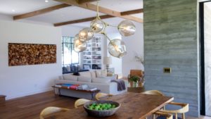
The exterior of the house is classic Gill with smooth plaster walls, simple lines and a flat roof. But inside, Wark created an up-to-the-minute feel with 12-foot-high ceilings, warm woods, layers of white and board-form concrete walls.
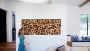
Custom details include 8-foot-tall Hollywood Regency-style doors, delicate wallpaper based on Klasfeld’s artworks and custom steel windows and doors, powder-coated black and made in Tijuana. A floating wall, filled with firewood, doubles as a vestibule and niche, giving the crisp white walls of the living room a warm, organic feel.
In the kitchen, white walls blend with board-form concrete partitions, white porcelain tile and rustic wide-plank oak floors. At the expansive kitchen island, the kids can rest on bar stools and chat with Klasfeld as she cooks. And in a striking touch, the panel-ready refrigerator is covered in hand-scraped white oak panels that are installed in a chevron pattern.
"This is my dream kitchen," Klasfeld says.
Perhaps the biggest impression, though, comes from the colorful blue Moroccan tile that Klasfeld spotted in Elle Décor magazine.
“I ripped the page out of the magazine years ago and saved it,” she says. “We searched the Internet and found the dealer in Belgium.”
But not everything is custom. Whenever possible, Wark used thrifty furnishings: White laminate IKEA cabinets in the playroom, porcelain countertops in the kitchen instead of high-priced Carrara marble, bar stools from CB2 in the kitchen, and West Elm furnishings in Frankie’s room.
Relaxed yet refined, the finished project evokes a warmth that is undeniable.
It’s a feeling that is not lost on Klasfeld, who anticipates that her first home may be her last.
“I plan on hosting my grandkids here someday,” she says with a smile.
With a careful eye to materials, finishes and color palette, designer Bryan Wark highlights what makes this house work so well:
“Jamie wanted the design to have an organic quality, to seamlessly integrate into its surroundings. The sense of indoor/outdoor California living was really important to her. We selected rustic wide-plank oak for the floors and hand-scraped Douglas fir for ceiling beams. The contrast of warm woods set against crisp white walls created balance and a serene setting for all of the furnishings.”
(Jay L. Clendenin / Los Angeles Times)
“Contrasting black and white is prevalent throughout the home. Interior doors are tall Regency style and lacquered black. The exterior doors and windows are all custom made out of steel and powder coated in black. With the expanse of white walls, I really like the way black creates definition in an open floor plan, delineating and punctuating space. It’s a timeless combination I never tire of using.”

(Jay L. Clendenin / Los Angeles Times)
“Every single wall in the house is white but a combination of different whites. Each was chosen based on the light of the room, a whisper of gray or a touch of pink. The house is so full of natural light that the walls change color depending on the time of day.”
(Jay L. Clendenin / Los Angeles Times)
“I designed the kitchen around the tiles. I hate the term ‘bohemian chic’ but admit that cultural elements, whether Moroccan or East African, give a home an organic feel. If I had to call it something I’d call it Modern Moroccan. One of the reasons I love the house is it is unadorned with white walls and simple black window frames. That’s what makes the tiles stand out. It’s a pop of color that works.”

(Jay L. Clendenin / Los Angeles Times)
“Almost all of the plumbing fixtures and hardware are brass but finished differently. We used un-lacquered brass so some elements would patina over time and satin brass where we wanted the finish to remain static. It warms up the overall design.”

(Jay L. Clendenin / Los Angeles Times)